

Back in the early days, sharing my vision of design systems to the team.
When I joined Netspend, I recognized a need for a more cohesive approach to designing digital products. While we had a style guide in place to ensure brand consistency in terms of fonts and colors, there was a lack of a comprehensive system for guiding the user experience. This resulted in inconsistencies and disjointed interactions across our products.
Realizing the importance of providing a seamless and unified experience for our customers, I championed the development and implementation of a design system. Through internal evaluation, it became apparent that dedicating time to its creation would play a pivotal role in establishing a shared language and enhancing uniformity across our full range of products.
Taking inventory
Understanding the importance of assessing the current state of our existing products, a UX researcher and myself diligently took inventory of all the different styles, components, and patterns we were utilizing. This comprehensive assessment was crucial in understanding the scope of inconsistencies and inefficiencies present within our design ecosystem.

Small sample of the screenshots and notes we took while taking inventory.
The inventory exercise exposed a myriad of issues that were hindering our design cohesiveness. Dozens of button styles, inconsistent font weights, lack of logic in spacing, and many other discrepancies came to the forefront.
Armed with this comprehensive understanding of the current design landscape, I was able to effectively communicate the urgency and value of implementing a design system. It became clear that this endeavor was not only a necessity but also an opportunity to elevate our products, foster efficiency and establish a unified design language.
Structure and organization
As a team, we embarked on an extensive evaluation of existing design systems, seeking inspiration and insights to inform the structure and organization of our own. While we had a general idea of what we wanted to achieve, researching and studying how other design systems were structured proved invaluable in understanding the key components and elements we wanted to incorporate.
It was crucial to me that our design system transcended being a mere collection of user interface elements. I envisioned it as a comprehensive resource that not only provided the components but also communicated the reasoning behind our design choices. It needed to serve as a guide, offering clear directives for applying these components in real-life situations and illustrating how the patterns worked harmoniously together.
Drawing inspiration from Atomic Design principles, we laid the groundwork for our design system. We adopted a similar five-stage approach, recognizing the effectiveness of its methodology. However, we decided to relabel the stages to enhance clarity and comprehension, taking inspiration from GE's design system. We wanted to ensure that even those unfamiliar with the original Atomic Design concept could easily grasp the structure and its purpose.
Here's where we landed with our system's structure:


Documentation
It was essential that every member of our organization had a reliable resource to access detailed information about each aspect of the design system. My goal was to provide not just surface-level explanations, but rather detailed insights, guidelines, and best practices for each pattern within the design system. This included illustrating how components should be used effectively through examples and interactive demos whenever feasible.
Key factors that I prioritized while documenting our design system included:
Guiding principles and philosophies that inform the design decisions within the system.
Design tokens used in the system, such as color values, font sizes, spacing units, and other variables that define the visual style—ensuring that designers and developers use the same values throughout the system.
Guidelines for interaction design, including transitions, animations, micro-interactions, and other motion-related behaviors—with prototypes to help show how these small additions create engaging and consistent user experiences.
Accessibility guidelines and best practices for designing accessible interfaces, including requirements for color contrast, keyboard accessibility, screen reader compatibility, and other accessibility considerations.
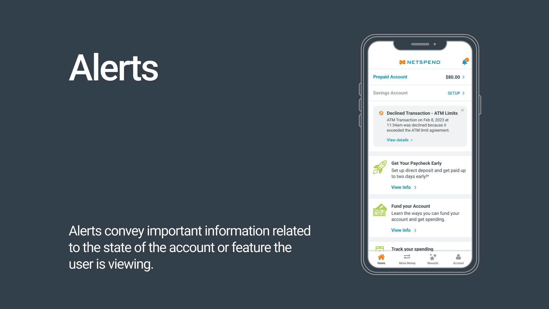
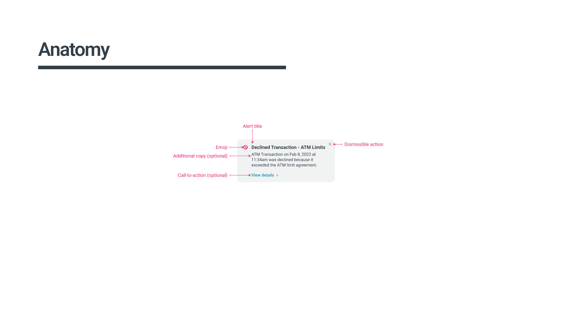
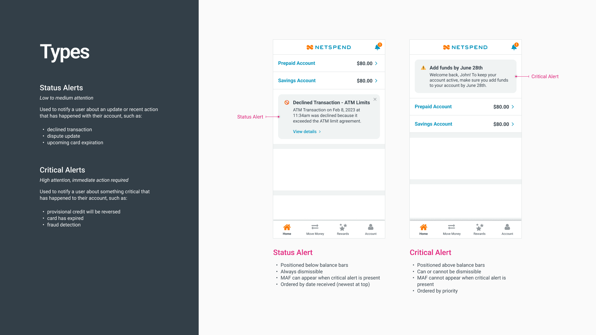
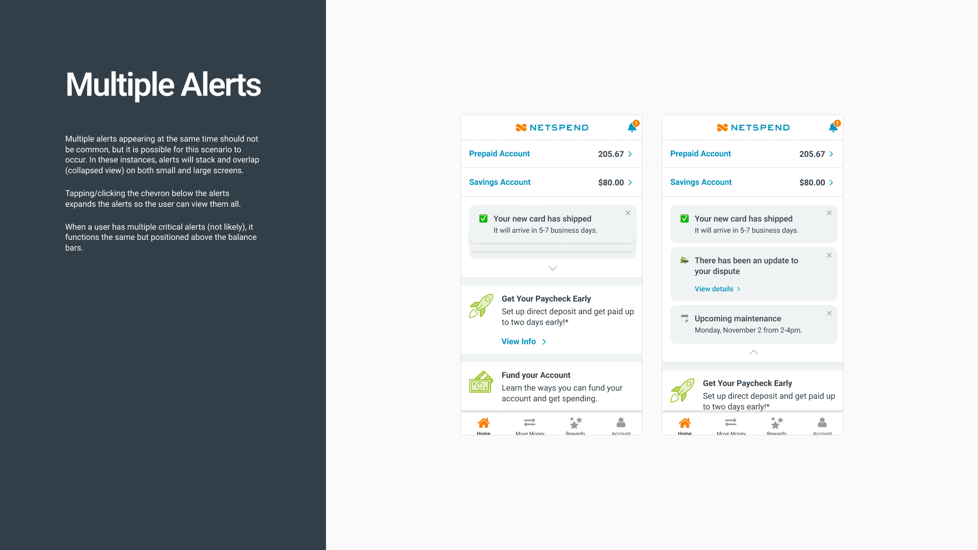
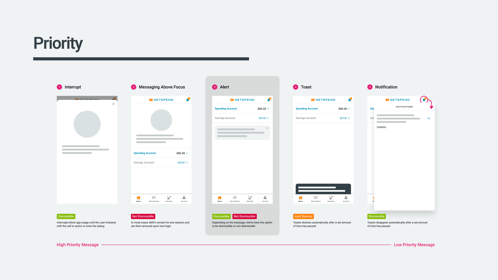
Some of the documentation for our 'Alert' component.
For most components, I also created prototypes to help show how transitions, animations, micro-interactions should behave.
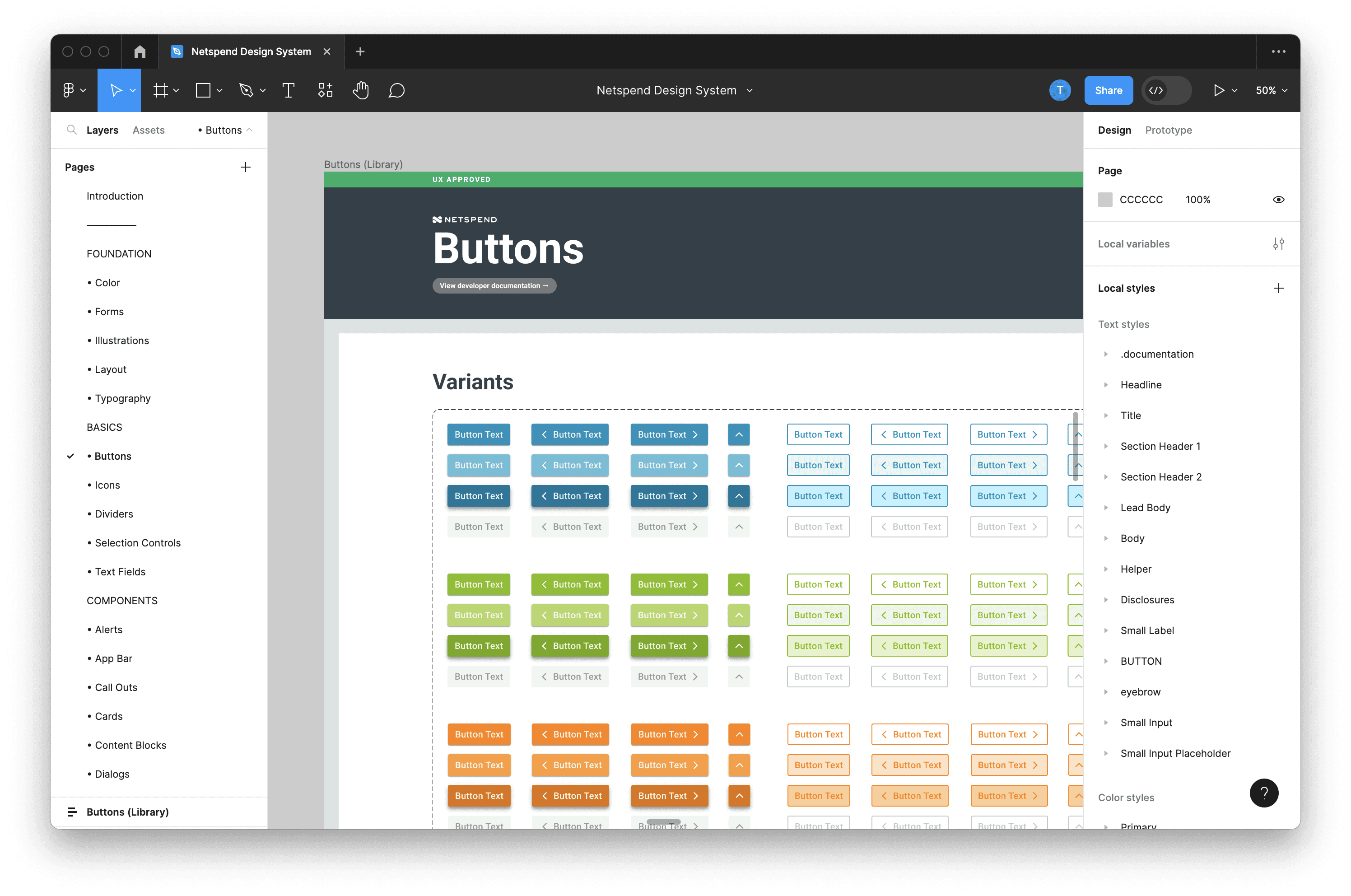
Overall, the sticker sheet provides a practical and streamlined approach to design by offering a centralized collection of commonly used patterns that can be easily accessed and utilized by anyone during the design process.
Results
The adoption of a design system has proven to be a game-changer, offering numerous advantages that have transformed our design and development processes:
Amidst the plethora of communication channels, the design system serves as a single source of truth, providing clarity and certainty about how each element should appear and function.
Put an end to the ambiguity of design decisions, eliminating questions regarding button colors or spacing, leading to a consistent and polished appearance.
Leveraging reusable patterns, we have significantly expedited our design and implementation processes, resulting in cleaner and more efficient code.
Product managers now have a comprehensive view of all components and patterns within the design system, streamlining their ability to assess existing resources and plan for future needs.
Our team is now better equipped to test, iterate, and place a strong focus on delivering an exceptional user experience.
The design system's impact has been profound, fostering collaboration, efficiency, and creativity among our teams. By providing a solid foundation and a unified language, it has unlocked the potential for innovation, enabling us to deliver products that are consistently user-centric.