

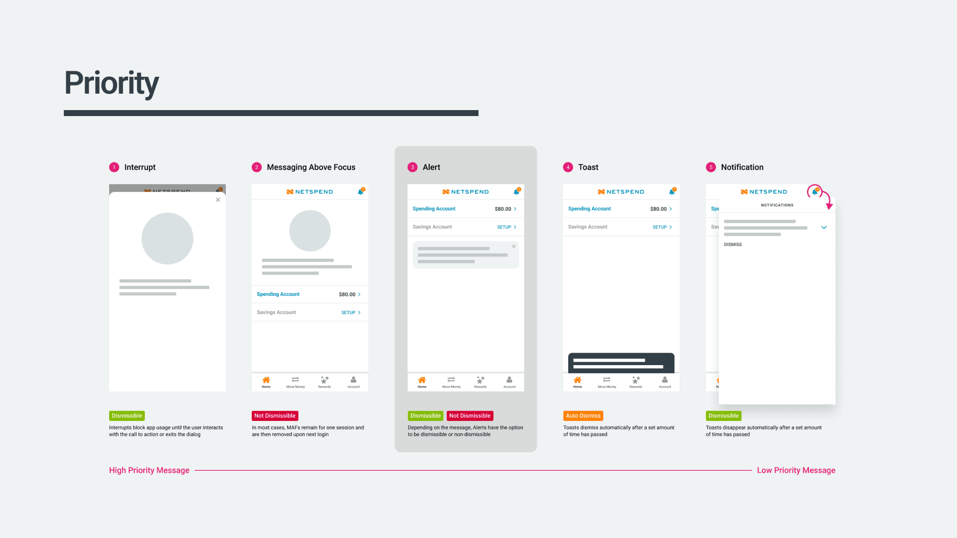
The two options for in-store cash loads; the traditional way by using a card or the new barcode option.
Overview
The initial request from the product manager seemed rather simple—enable users to deposit cash into their account by utilizing the Netspend app to:
find a nearby participating retailer
generate a barcode for that retailer
and subsequently, have a cashier at the retailer scan the barcode to deposit the cash

The Netspend app already had a feature for finding nearby retailers, but the loading process was slightly different from this new method. Instead of scanning a barcode on the user's phone, the cashier would swipe the user's physical card. My first instinct was to simply expand upon the existing feature—but a few challenges popped up along the way that made me rethink that initial thought.
but why?
The rationale behind introducing this new functionality was clear and multifaceted. First, we were in the process of launching digital-only accounts where users were not issued physical cards. For these users, the barcode reload feature became an essential means to add cash since the traditional method was unavailable to them. Additionally, our analysis revealed a noteworthy trend among users with physical cards—they were increasingly relying less on them for transactions. In fact, by 2020, a significant 25% of all point-of-sale payments were being conducted via mobile wallets. This new barcode-based option catered to both user segments, offering added convenience to those without physical cards and providing an alternative method for those who preferred to leave their cards at home while on the move.
The current state
Given my prior unfamiliarity with the 'reload locations' feature and recognizing that it had remained unchanged for an extended period, I saw the value in soliciting direct user feedback to assess its current effectiveness. In an effort to gauge user perceptions and uncover potential pain points, I conducted a straightforward, unmoderated usability test involving 10 Netspend users. Their task was to identify a nearby reload location without fees. While all participants eventually succeeded in this task, the process was not without its challenges, highlighting the existence of several issues within the current design that demanded attention and improvement.

The two options for in-store cash loads; the traditional way by using a card or the new barcode option.
Instead of trying to add on to what was currently there, I ended up proposing a redesign of the user interface to better correspond with contemporary patterns prevalent in many map applications today. Though the additional work would extend the initial scope, the stakeholders concurred that it was essential for delivering the optimal outcome for our customers.
Defining the objective
Drawing on the insights gathered from my research, I distilled the findings into a clear and concise problem statement that encapsulated the pain points our users were experiencing.

Problem Statement
Users are in search of a simplified and user-friendly in-store cash loading method, which is particularly vital for those without a physical card. The implementation of a barcode-based solution should not only address these pressing user needs but also eliminate any potential confusion typically associated with the in-store cash addition process.
Furthermore, I began to construct a user persona, representing a distinct segment of our target audience by amalgamating insights garnered from previous surveys and interviews with the fresh perspectives gained through unmoderated usability tests. The key persona represented Maria, a restaurant server who heavily relied on cash tips and found it inconvenient to load these funds onto her prepaid account. By mapping out Maria's needs, frustrations, and motivations, we could ensure that the redesign of the reload location finder and the introduction of the barcode method would be highly user-centered and tailored to meet her specific requirements. This helped lay the groundwork for the creative brainstorming and prototyping that would follow, as we set out to devise solutions that truly resonated with our users.

Ideate
Recognizing the importance of visualizing the two flows from a high level, I started this phase by created a simple flow chart. It provided a clear side-by-side comparison, enabling an understanding of how these two methods would seamlessly coexist and complement each other. This visual representation also became a valuable resource for communication within our team and with stakeholders, ensuring that everyone shared a clear and unified vision.

One of my favorite parts of the design process are the brainstorming sessions with the team. I do my best to foster an open and inclusive atmosphere where every member is encouraged to contribute as I believe that exceptional ideas often emerge from diverse perspectives. Here we explored a multitude of concepts, from the technical intricacies of barcode generation to the user interface design that would seamlessly integrate this new method. We challenged assumptions, questioned existing norms, and encouraged "out-of-the-box" thinking, pushing ourselves to envision a solution that would truly elevate the reload process.

As ideas flowed freely, I translated our conceptual brainstorms into tangible sketches that would allow us to take our first steps toward giving shape to our vision.
Throughout the brainstorming and sketching phase, we remained firmly committed to a user-centered approach. Every sketch, every idea, was evaluated against its potential to enhance the user experience. We continually asked ourselves how the barcode reload method would make life easier for our users. How could it reduce friction, improve efficiency, and provide greater security? This user-centric mindset guided our sketching efforts, ensuring that every design decision was rooted in meeting our users' needs and addressing their pain points.
Initial ResearchUpon delving deeper into the project, one of my earliest tasks was examining the existing state of the reload location feature. It hadn't been updated for a considerable period, and it became evident that there were numerous aspects that could be enhanced.As I further investigated, it became increasingly apparent that merely extending the present design wouldn't be advisable. Instead, I opted to revert to the stakeholders and propose a major redesign of the user interface to better correspond with contemporary patterns prevalent in many map applications today. Though the additional work would extend the initial scope by six weeks, everyone concurred that it was essential for delivering the optimal outcome for our clients.
The Current State
One of the first things I did after learning more about the project was examining the current experience of the reload locations feature. The feature had not been refreshed in quite some time and it was easy to see that there was a lot that we could improve on.
subhead here
After gaining more knowledge about the project, I delved into examining the present state of the 'reload locations' feature. It became increasingly apparent that merely extending the present design wouldn't be advisable. Instead, proposed a major redesign of the user interface to better correspond with contemporary patterns prevalent in many map applications today. Though the additional work would extend the initial scope, the stakeholders concurred that it was essential for delivering the optimal outcome for our customers.
It hadn't been updated for a considerable amount of time, and it became evident that there were numerous aspects that could be enhanced.
Upon delving deeper into the project, one of my earliest tasks was examining the existing state of the reload location feature. It hadn't been updated for a considerable period, and it became evident that there were numerous aspects that could be enhanced.As I further investigated, it became increasingly apparent that merely extending the present design wouldn't be advisable. Instead, I opted to revert to the stakeholders and propose a major redesign of the user interface to better correspond with contemporary patterns prevalent in many map applications today. Though the additional work would extend the initial scope by six weeks, everyone concurred that it was essential for delivering the optimal outcome for our clients.
The more I dug in, the more I started to realize that adding on to this existing design was not something I would recommend. Instead, I decided to go back to the stakeholders and discuss redesigning a majority of the user interface to better align with newer patterns found on many of map applications today. The extra work was estimated to increase the original scope by six weeks, but all agreed that it was necessary to produce the best possible outcome for our customers.
Prototype & Test
After sketching out many different ideas and presenting those to the stakeholders, we all agreed to test the flow that immediately prompts the user to decide what type of reload they want to do (have the cashier at the store swipe their physical card or scan a barcode on their phone) before locations are seen on the map.
Using the sketches as my guide, I then designed all the screens necessary, built out a prototype in Figma and connected with the UX researcher to create a test plan. Our main goals were to gauge the understanding and opinions around the barcode reload concept and discover any friction points that users had in the overall flow.
We created a scenario around a real life situation that a user could potentially come across. The script went as follows:
Once the participant completed the task, we proceeded to ask them to find the closest reload location to their position – disregarding fees and method (card or barcode), we solely needed the nearest one. We then followed up with these questions related to their experience:
What do you think about the idea of loading cash in a store using a barcode on your mobile device rather than using your physical card?
Is there anything confusing about the idea?
Talk about what you like and dislike about this feature and why.
When looking for locations to load cash onto your card, which do you prefer: the list view of nearby stores or the map view? Why?
Results
Finding and using the feature to generate a barcode is easy for all users—every user was able to complete the task.
No one used the filter; rather, they tapped through options on the map. Could be because there were only a few locations on the map (i.e. more locations might prompt them to use the filter) or they did not notice it.
List vs. Map view preferences: Most users say that they prefer list view, but their actions indicate their preferences are dependent on whether they want to browse (map) vs. find a specific known location (list). When browsing, participants tapped through the map. When they needed to find a known location or there were too many options on the map, people used the ‘List view.’
It is unclear to users what will be sent to them when they tap on ‘Send to phone’ or ‘Send to email,’ and some (4 users) think that they will be sent the reload barcode (one user's comments: "Send what to phone, though? I don't know what it's sending...maybe the barcode."). Users are clearer on what ‘Get directions’ might do, with many thinking it would open Google maps.
Overall takeaway: Almost all users like the idea of loading cash with a barcode. They said it felt more secure than using your card and was very convenient for those times that you don’t have your card on you.
Iterate
After observing user interactions with the prototype, we collected valuable feedback and insights, leading us to polish and enhance the design.
A significant problem I observed was when we requested users to locate the nearest reload spot, irrespective of fee expense and reload method. Making the change from barcode locations to card locations (or vice versa) seemed inefficient, and I disapproved of having users retrace their steps to adjust this before moving forward. Therefore, I explored ideas where the option to make that change to be placed directly within the map/list view. After conducting further testing rounds with multiple alternatives, we agreed on utilizing a toggle, permitting users to rapidly switch between the two and fixing it to the bottom for enhanced accessibility.
A quick introduction of the new feature—using a tooltip type of approach to help guide the user’s attention to the location of this new option
Altering the description of the overall feature for clearer user comprehension regarding the ultimate objective
Updated to use a more traditional pin you'd see on a map with icons that help reenforce what type of location it is
Updated icon for "use your location" to a more common icon seen in other map applications
Using a similar toggle to switch between map and list view
Cleaned up location details so the information is easier to digest
A more prominent message related to the active barcode which also served as quick way for the user to find and open the barcode when they arrived at the store

Some of the documentation for our 'Alert' component.
The inventory exercise exposed a myriad of issues that were hindering our design cohesiveness. Dozens of button styles, inconsistent font weights, lack of logic in spacing, and many other discrepancies came to the forefront.
Armed with this comprehensive understanding of the current design landscape, I was able to effectively communicate the urgency and value of implementing a design system. It became clear that this endeavor was not only a necessity but also an opportunity to elevate our products, foster efficiency and establish a unified design language.


Some of the documentation for our 'Alert' component.
Structure and organization
As a team, we embarked on an extensive evaluation of existing design systems, seeking inspiration and insights to inform the structure and organization of our own. While we had a general idea of what we wanted to achieve, researching and studying how other design systems were structured proved invaluable in understanding the key components and elements we wanted to incorporate.
It was crucial to me that our design system transcended being a mere collection of user interface elements. I envisioned it as a comprehensive resource that not only provided the components but also communicated the reasoning behind our design choices. It needed to serve as a guide, offering clear directives for applying these components in real-life situations and illustrating how the patterns worked harmoniously together.
Drawing inspiration from Atomic Design principles, we laid the groundwork for our design system. We adopted a similar five-stage approach, recognizing the effectiveness of its methodology. However, we decided to relabel the stages to enhance clarity and comprehension, taking inspiration from GE's design system. We wanted to ensure that even those unfamiliar with the original Atomic Design concept could easily grasp the structure and its purpose.
Here's where we landed with our system's structure:

Foundations
The foundational level of the design system that designers should reference and respect when creating new design patterns

Basics
Design patterns that fall on the simple side of the spectrum

Components
Design patterns that fall on the moderately complex side of the spectrum

Layouts
The layout and structure of a section or page

Features
Flows/systems that, when working together, allow users to accomplish a task or solve a problem
Some of the documentation for our 'Alert' component.
Documentation
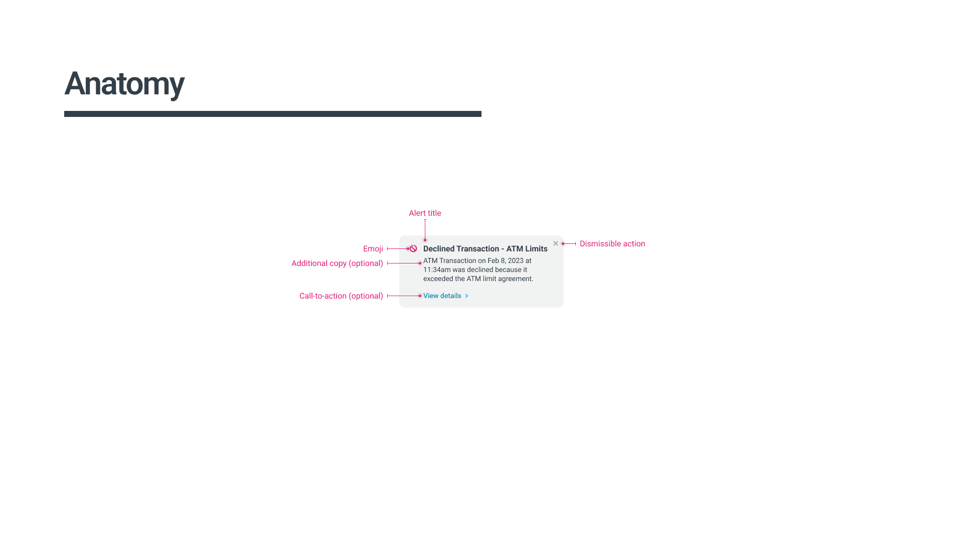
It was essential that every member of our organization had a reliable resource to access detailed information about each aspect of the design system. My goal was to provide not just surface-level explanations, but rather detailed insights, guidelines, and best practices for each pattern within the design system. This included illustrating how components should be used effectively through examples and interactive demos whenever feasible.
Key factors that I prioritized while documenting our design system included:
Guiding principles and philosophies that inform the design decisions within the system.
Design tokens used in the system, such as color values, font sizes, spacing units, and other variables that define the visual style—ensuring that designers and developers use the same values throughout the system.
Guidelines for interaction design, including transitions, animations, micro-interactions, and other motion-related behaviors—with prototypes to help show how these small additions create engaging and consistent user experiences.
Accessibility guidelines and best practices for designing accessible interfaces, including requirements for color contrast, keyboard accessibility, screen reader compatibility, and other accessibility considerations.
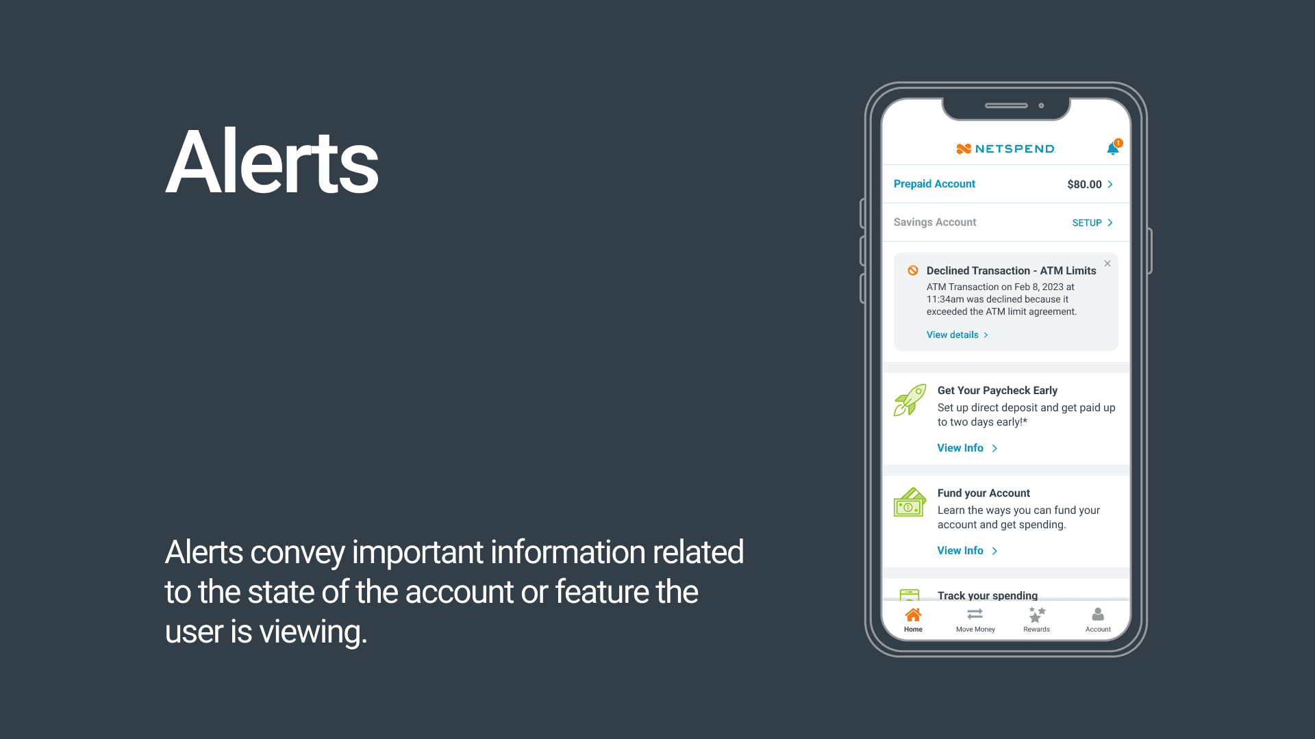
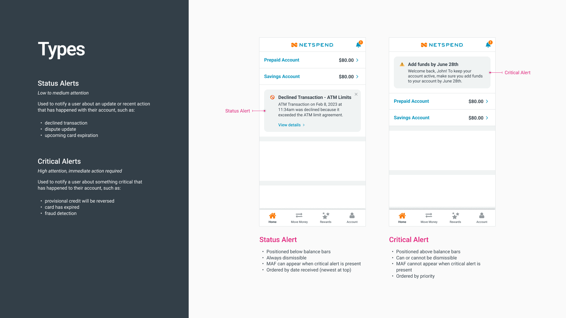
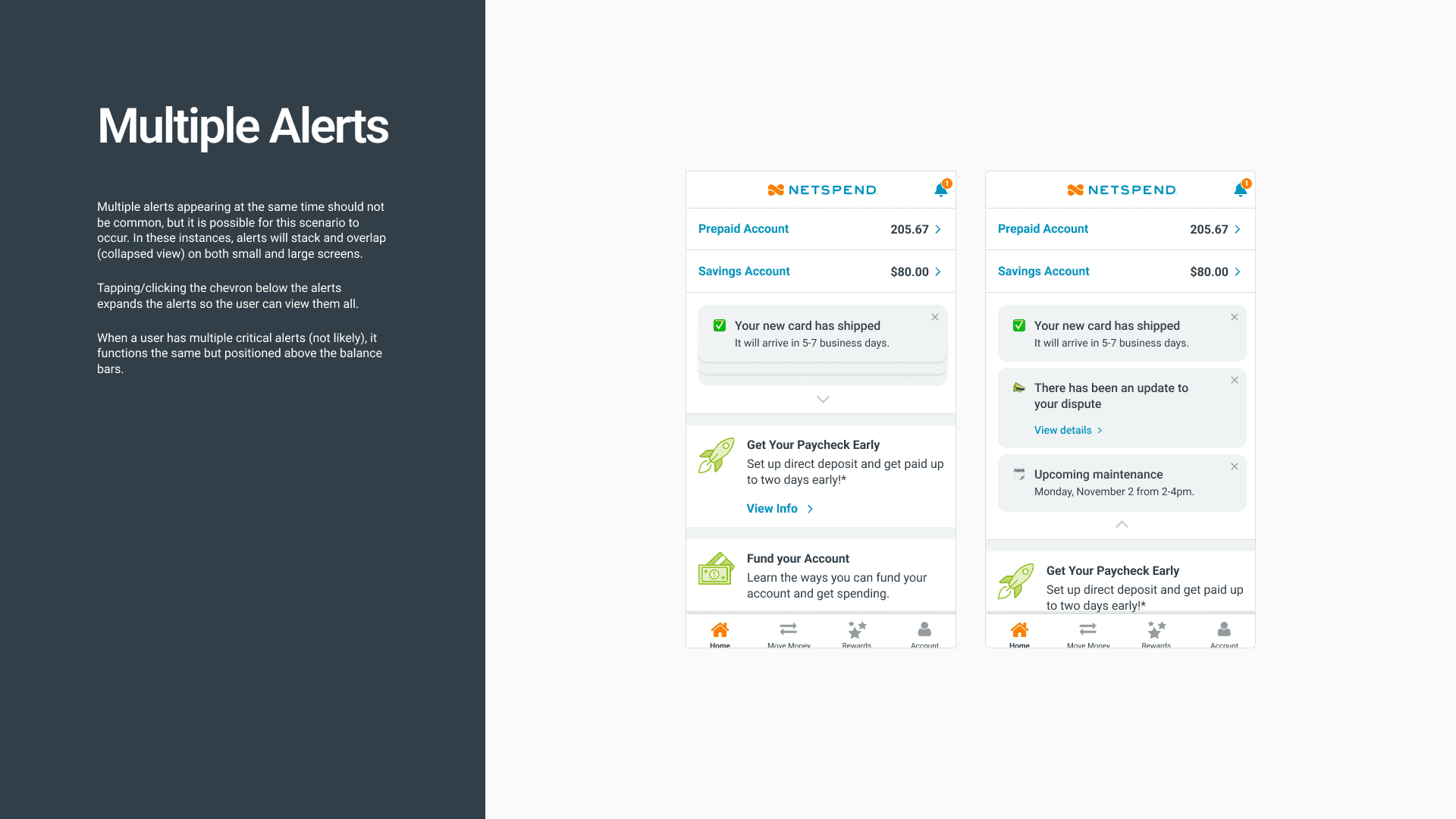
Some of the documentation for our 'Alert' component.
For most components, I also created prototypes to help show how transitions, animations, micro-interactions should behave.
Component library
Just one quick thing to note, while we labeled it our 'component library' it also included elements from the 'foundation' (color, spacing, etc.) and 'basics' (buttons, text fields, etc.) tiers as well.
Chances are, you're already aware of the indispensable nature of a shared component library in Figma for any design system. But in case you aren't, let me briefly explain why they're so crucial:
Efficiency: Every designer at Netspend would be able to quickly access frequently used design elements without recreating them from scratch, thereby speeding up the design process.
Consistency: By utilizing predefined "stickers", designers ensure visual consistency across different screens or components within a project.
Collaboration: Sticker sheets can be shared among team members, allowing everyone to work with the same set of design elements, promoting collaboration and maintaining design integrity.
Iteration: I set up a branching process in Figma so that the sticker sheet could be easily reviewed, updated and modified, making it easier to iterate and refine designs.
Overall, the sticker sheet provides a practical and streamlined approach to design by offering a centralized collection of commonly used patterns that can be easily accessed and utilized by anyone during the design process.
Results
The adoption of a design system has proven to be a game-changer, offering numerous advantages that have transformed our design and development processes:
Amidst the plethora of communication channels, the design system serves as a single source of truth, providing clarity and certainty about how each element should appear and function.
Put an end to the ambiguity of design decisions, eliminating questions regarding button colors or spacing, leading to a consistent and polished appearance.
Leveraging reusable patterns, we have significantly expedited our design and implementation processes, resulting in cleaner and more efficient code.
Product managers now have a comprehensive view of all components and patterns within the design system, streamlining their ability to assess existing resources and plan for future needs.
Our team is now better equipped to test, iterate, and place a strong focus on delivering an exceptional user experience.
The design system's impact has been profound, fostering collaboration, efficiency, and creativity among our teams. By providing a solid foundation and a unified language, it has unlocked the potential for innovation, enabling us to deliver products that are consistently user-centric.